“My way is to divide half a sheet of paper by a line into two columns; writing over the one Pro and over the other Con. Then during three or four days’ consideration, I put down under the different heads short hints of the different motives, that at different time occur to me, for or against the measure. When I have thus got them altogether in one view, I endeavor to estimate their respective weights; and where I find two, one on each side, that seem equal, I strike them both out. If I judge some two reasons con equal to some three reasons pro, I strike out five; and thus proceeding, I find where the balance lies; and if after a day or two of further consideration, nothing new that is of importance occurs on either side, I come to a determination accordingly.” –Benjamin Franklin
Last week we talked about the importance of being decisive and went over some basic tips for how to make good decisions. We mentioned the pro and con chart as being a helpful part of the decision-making process. As you can see from the above quote, Ben Franklin was a fan of the pro and con chart himself and added his own twist by giving different weights to his various motives.
But what if you try the pro and con chart and the right decision still isn’t clear? You’ve done all the research you can about your possible choices; you’ve journaled your thoughts; you’ve sought the advice of your friends and loved ones. But you’re still absolutely stuck between two or more choices that seem equally attractive. How can you break this stalemate?
Today we’re going to go over a decision making hack that expands on and improves the technique practiced by old Ben. When you’re agonizing over a decision, it can help you discover which choice would really be best.
How to Decide Between Two or More Attractive Possibilities
Every decision has its advantages and disadvantages. The trick is to figure out which choice will give you more of the former and less of the latter. A typical pro and con chart can be too vague. This is where a decision “balance sheet” comes in. If you want to get really fancy, philosophers who study decision making (yes, there is such a thing) call it a “multi-attribute optimization chart.” Get out a sheet of paper, gents, you’re about to become The Decider.
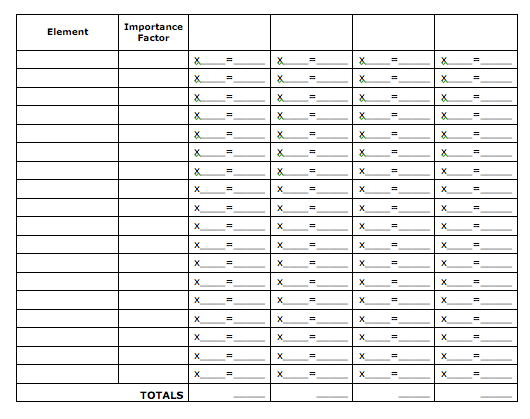
1. Make your columns. You need two columns. Label the first column “Element” and the second column “Importance Factor.” Next to those two columns, create as many columns as you have possible choices. Label these columns with the names of your choices. For example, “Job in Seattle” and “Job in Phoenix.”
2. List the important elements of your decision. In your “Element” column, list all the major elements that influence your decision. For example, if you’re trying to decide between jobs, you would list things like location, pay, benefits, job security, work hours, enjoyment, etc.
3. List the importance factor of each element. In your “Importance Factor” column, assign each element a number from 1 to 10 according to how important that element is to you. For example, if the time your job will allow you to spend with your family is very important to you, give that element a 9. If being close to your family isn’t as important to you, then give it something like a 4. Put down the first number that comes to you; don’t overthink it.
4. Grade the choices in relation to each element. You’re now going to assign a number from 1 to 10 in relation to how each choice measures up to the elements you have listed. For example, if the job in Seattle offers an excellent health insurance plan, you would give it a 9. If the job in Phoenix would sometimes have you working 60-hour weeks, then you would give it something like a 5 for “work hours.” Again, don’t think too much about it; just put down the first number that comes to your mind. These numbers go on the left side of your choice columns. Make sure you leave room on the right side of the column for another number.
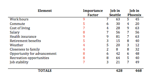
5. Multiply the importance factor by the grades for each choice. For example, if you gave the importance of the pay element a 8, and you gave the Job in Seattle a 7 for that job’s potential salary, you would take 8X7 and would come out with 56. This number goes on the right of your choice column.
6. Add up the totals. Once you have multiplied all of your importance factors by your choice grades, add all those numbers up to get a total. Which choice has the highest number of points? That’s probably the best choice for you.
These directions may make it sound more complicated than it really is. It’s actually quite simple once you see an example of a chart. Here is an example chart of choosing between two different jobs. Let’s say that both jobs seem attractive, but you want to figure out which would be the best job for you and your way of life. Here’s how you could figure out which job to take:
After multiplying the importance factor by our choice grades, and then adding those totals up, we’re left with the Seattle Job scoring 428 and the Phoenix Job scoring a 468. Looks like you’re moving to Phoenix! Of course, there is a possibility that you come up with some false positives doing this exercise. Even though you try not to be biased, there’s a tendency to give the choice you really want higher scores, even if it really doesn’t warrant those scores. Despite that small drawback, multi-attribute choice optimization does a pretty good job of helping you come to a choice (after all, if you’re inflating the scores of one of your choices, then deep down you probably already know which one you want!). It forces you to really think about all the factors going into your decision. Kate and I have used it several times when making big choices, and it has always proved helpful. Go ahead and give it try with the sample card below. Remember you can download a PDF with a couple of these worksheets ready for you to use. Enjoy!
 Post inspired by the 1963 Doubleday Personal Success Program
Listen to our podcast on using mental models to make better decisions:


