Editor’s note: This post was written by Jason Robert and originally ran on ITS Tactical.
Today we’re going to discuss how to read terrain off of a map. Reading terrain is more about artistic visualization than it is science. There are three major factors that aid in the visualization of terrain from a 2d map:
- Contour Lines
- Colors
- Shading
The ability to fuse these major factors is the most critical skill one can learn when using a topographic map. The primary purpose of a topographic map is to accurately represent the shape of the Earth’s surface, but the utility doesn’t stop there. Topographic maps also represent streets and trails, vegetation, streams, and every type of feature that may positively or negatively impact your ability to navigate through the terrain.
Note: This article uses the Sam Houston National Forest as its cartographic reference. If you’d like to download a PDF of the referenced topo map, it is the Huntsville 7.5 x 7.5 1997 map.
Contour Lines

Contour lines are imaginary; they are map artifacts used to represent paths or segments of Earth at an equal elevation. These paths and segments are presented as elevations (vertical distance above or below sea level) and reliefs (the shape of terrain features on the Earth’s surface).
Not all contour lines are created equal. Heavier contour lines are known as indexed contour lines and are normally numbered showing elevation. Typically every fifth contour line is an index.
Lighter contour lines, that fall between indexed lines, are known as intermediate contour lines. These lines do not have their elevation given and are found in sets of four between indexed contour lines.
Finally, when the terrain is expansively flat, cartographers will often include supplementary contour lines, which are dashed lines indicating an elevation that is half of the elevation between the contour lines surrounding it. They are typically found where there is little change in elevation.

The key thing to remember about contour lines is this: The closer the spacing, the more rapid the change in elevation. For a leisurely Sunday stroll, you might be looking to cross just a few contour lines, or perhaps follow a trail that shadows a few contour lines on the map. For rock climbing, look for a concentration of contour lines in a single area. If you’re looking for a true vertical cliff, look for a series of contour lines drawn so closely together that they appear to be a single line.
The Huntsville quad doesn’t really have any hard elevation terrain (though navigating swamps can be pretty hard). Notice the foot trail along the top image above. It intersects two indexed contour lines, but the distance between the indexed contours is pretty significant; it’s easy to see that this is a very easy path to navigate with respect to elevation gain.
In contrast, the bottom graphic shows a hill where the top is at 438’. The indexed contour line to the immediate left is 400’, and the one further left is 350’. Walking up the western face of this hill would be more challenging than traversing the easy foot trail.
Topographic Map Colors

It’s important to know what kind of terrain and environment you’re traveling into and what the map of that area is telling you.
The color brown is used to denote most contour lines on a map, which are relief features and elevations. Topographic maps use green to denote vegetation such as woods, while blue is used to denote water features like lakes, swamps, rivers, and drainage.
At higher elevations, mountains may be snow-capped year around, or the terrain may actually be a glacier. In each of these cases, contour lines are also drawn in blue. It is therefore possible to quickly discern that a particular route from A to B might be more treacherous than operating at a high altitude—the trek might require crampons, an ice axe, and other materials that might not be readily available once in the backcountry.
Finally, black is used to represent man-made objects, including trails. Red is used for man-made features, like main roads or political boundaries, and purple for new changes or updates on the map that weren’t previously represented. Newer maps no longer use purple, but since so many older maps exist, it’s worth mentioning.
At the bottom of the Huntsville quad is Lake Ravenshaded in blue, since it’s a water feature. Notice the thick red line, delineating a political feature, the state park boundary. The majority of the image is shaded green, showing that this part of the map is full of vegetation. Contour lines are present in brown, as are two different types of paths: an unimproved or 4-wheel-drive trail represented by parallel dashed lines and a foot trail represented with a single dashed line.
Admittedly outside of our topographic scope, it’s worth noting that the USGS also provides extensive documentation on colors (and shading) for representing geologic features. This could be particularly useful for those interested in either rock climbing or geology in general. See the USGS Colors and Patterns for Geologic Maps for more details. If I ever get the opportunity to spend a couple weeks in southern Utah, I intend on bringing along a geologic map in addition to my topographic map because I enjoy knowing that I’m looking at rock that dates back to the Jurassic or Cretaceous period.
Shading

Color similarity between features does not mean that the features are equivalent. Due north of Lake Raven is the Prairie Branch, another name for a stream. Other names that equate to a stream include kill, run, fork, and brook. What’s interesting about Prairie Branch is that it has led to the formation of a wooded marsh or swamp.
Navigating across Prairie Branch could be difficult. Since this is Texas, expect to run into water moccasins, copperheads, and perhaps the occasional alligator, among all of the other friendly animals that call Sam Houston National Forest home.

Remembering map colors is a fairly trivial task, but remembering the shadings is far more difficult given the sheer number of variations. For this reason, keeping the USGS Topographic Map Symbols–a mere two sheets of paper–behind your map can be a lifesaver. A quick reference to page four of the booklet confirms that Prairie Branch is indeed a submerged wooded marsh or swamp.
Terrain Association
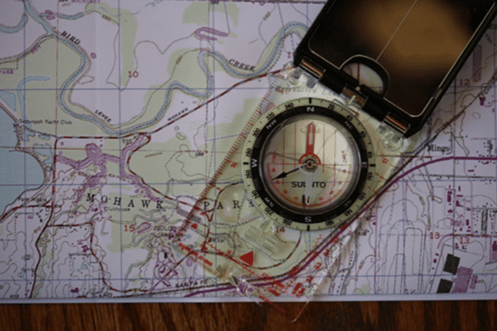
Orienting the map is an exercise that rotates the map so that north on the map is aligned with north in the real world. Orienting a map is critical because it allows you to point in a direction and know with confidence what terrain lies ahead. But if your compass breaks, how will you know where you’re headed?
It happens! You may find yourself in the backcountry with a map, but that fall (more like a slide) down that last rock face shattered your compass. Now what? Well, the key is to read the terrain and orient your map, a skill called terrain association. This task is far easier in mountainous or hilly areas than in areas where there is little to no reference, like in the plains or in a rain forest where your view is blocked.

The Huntsville quad isn’t the Rocky Mountains, so orienting a map is more challenging because you can’t simply look around and pick out the tallest peaks. That doesn’t mean that orienting the map isn’t possible. Notice how the map helps you visually see a valley? Close your eyes and imagine standing in the flat valley, somewhere near the ‘n’ in Robinson, then look east.
The map tells us that the valley isn’t heavily vegetated because it isn’t in green, but the hills to the east are. We also can tell from the contour lines that there is a significant elevation change of about 100’. It then becomes possible to visualize a slinking, rapidly rising set of hills with at least four distinct faces. (I’ve annotated the map with “YOU” to show your position, and four red arrows to show the faces to visualize.) Valleys are often easy to identify because there is typically a water feature running through the middle; the water feature is typically responsible for carving out the valley.

In the above image we can see two hills sitting across from each other. The change in elevation isn’t as dramatic as one might find in Utah or Colorado, but it’s a saddle. The key to identifying a saddle is to look for concentric circles with a space between them. Someone once told me that a saddle can be thought of as a frying pan with two eggs on it. There’s the surface of the pan, then there’s an elevation gain up to the egg whites and then there’s the top of the two hills, the yolks. It’s a silly but effective way to understand that the saddle is the dip between the two areas of higher terrain.

Hills also stand out on a map and are shown as single concentric circles. Above is an example of a very small hill with only about 20’ above its surrounding terrain.
Reading terrain isn’t difficult, but it requires the ability to close your eyes and envision the surrounding area sometimes. Other terrain features can be picked out on a topographic map, including cliffs, spurs, depressions, ridge lines, and draws.